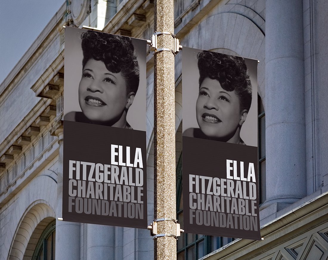

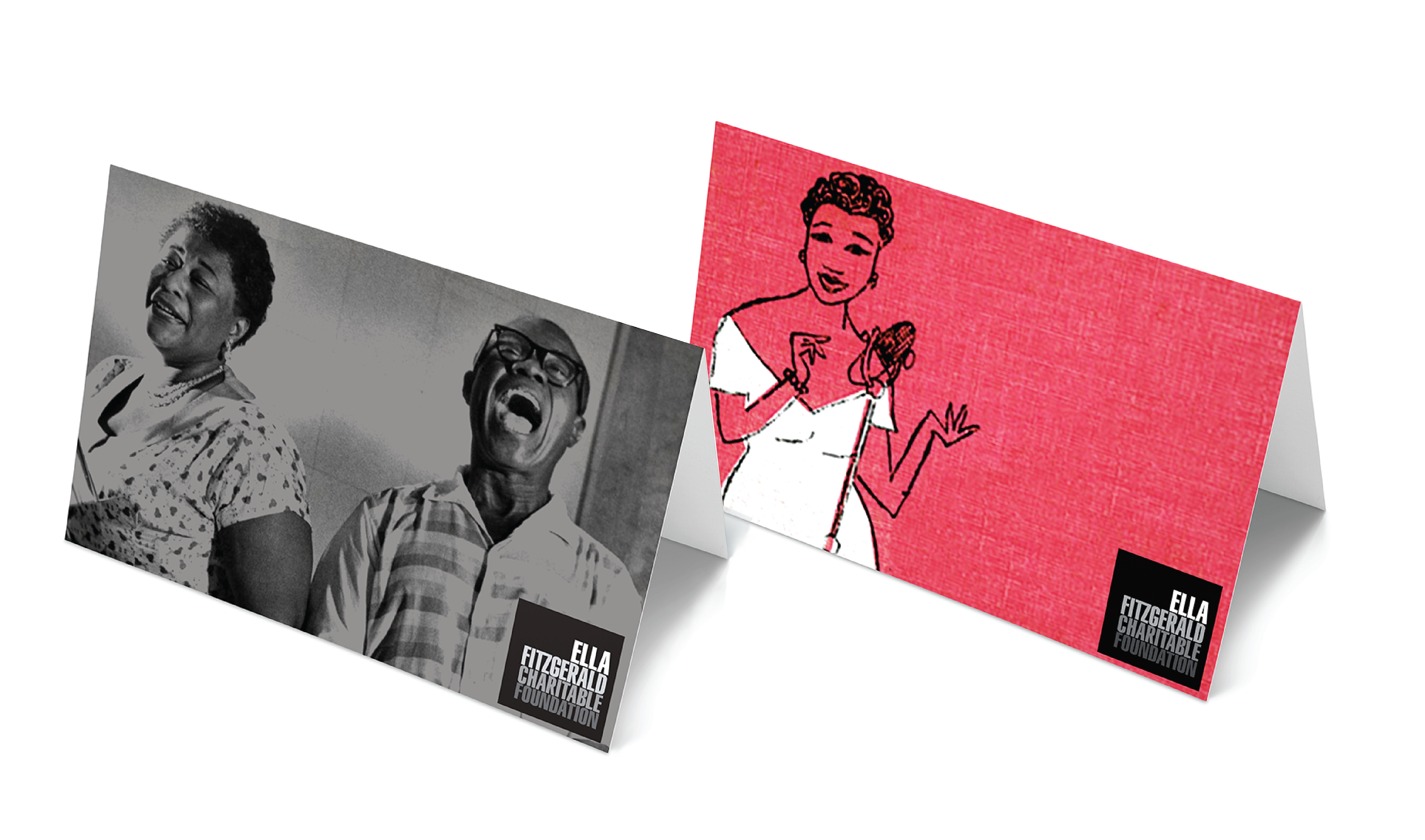

Very few musicians are known by their first name. Ella is in that select group. We were able to use this point of differentiation in the designing of their brand identity. Additionally the notion of sound is evident in the gradation of color used in the logo. In developing the identity system one challenge was clarifying how their variety of image assets were to be used. After categorizing the albums covers, photos of Ella, and photos of the programs, we recommended that images of Ella were always used in black and white allowing, the images from the foundation and Ella’s albums to remain in color.